【愚公系列】《微信小程序与云开发从入门到实践》056-迷你商城小程序的开发(电商应用首页开发)

| 标题 | 详情 |
|---|---|
| 作者简介 | 愚公搬代码 |
| 头衔 | 华为云特约编辑,华为云云享专家,华为开发者专家,华为产品云测专家,CSDN博客专家,CSDN商业化专家,阿里云专家博主,阿里云签约作者,腾讯云优秀博主,腾讯云内容共创官,掘金优秀博主,亚马逊技领云博主,51CTO博客专家等。 |
| 近期荣誉 | 2022年度博客之星TOP2,2023年度博客之星TOP2,2022年华为云十佳博主,2023年华为云十佳博主,2024年华为云十佳博主等。 |
| 博客内容 | .NET、Java、Python、Go、Node、前端、IOS、Android、鸿蒙、Linux、物联网、网络安全、大数据、人工智能、U3D游戏、小程序等相关领域知识。 |
| 欢迎 | 👍点赞、✍评论、⭐收藏 |
🚀前言
随着移动互联网的快速发展,电商行业也迎来了新的机遇与挑战。迷你商城小程序作为一种便捷的购物工具,逐渐成为消费者线上购物的重要选择。它不仅具备快速加载、易于分享的特点,还能为用户提供个性化的购物体验。
市场上电商类的小程序非常丰富,除了知名电商公司提供小程序应用外,各种社区团购、积分商城等也大多会选择小程序来支持其业务运营。本章,将开发一款功能完整的电商小程序应用,包括前端页面展示与云开发后端服务。
本期文章将重点介绍迷你商城小程序的开发,尤其是电商应用首页的设计与实现。我们将深入探讨首页的功能模块、用户体验设计以及技术实现等方面的内容。通过本次开发,我们希望能够为用户提供一个清晰、直观、便捷的购物入口,使他们能够轻松找到心仪的商品,并享受愉快的购物过程。
🚀一、迷你商城小程序的开发
首页通常用来展示推荐商品,本示例项目可以仿照一些知名的电商小程序的页面设计进行开发,首页主要包括商品分类栏、商品搜索、商品列表功能。商品分类栏、搜索和商品列表的数据提供都可以使用云开发实现服务接口,具体的渲染数据可以通过向数据库中添加示例数据来测试。
🔎1.使用 lconFont 文字图标
在项目开发中,我们经常需要使用各种图标来提升界面设计的视觉效果。图标的使用可以通过两种方式实现:一种是使用图片资源,另一种是使用文字图标。相比使用图片资源,文字图标有许多明显的优势:
- 更易控制大小:文字图标的大小可以通过 CSS 灵活调整,且更加方便。
- 节省资源空间:文字图标通常比图片文件占用更少的存储空间,加载速度更快。
- 灵活设置颜色:文字图标可以像文本一样,通过 CSS 控制颜色,方便统一管理和修改。
为方便学习和使用,我们可以直接通过 IconFont 官网 获取所需的开发图标库。在该素材库中,提供了很多专为电商应用设计的图标资源,可以选择一套开源且免费的图标进行学习和使用。
🦋1.1 获取并导入图标
-
选择图标:
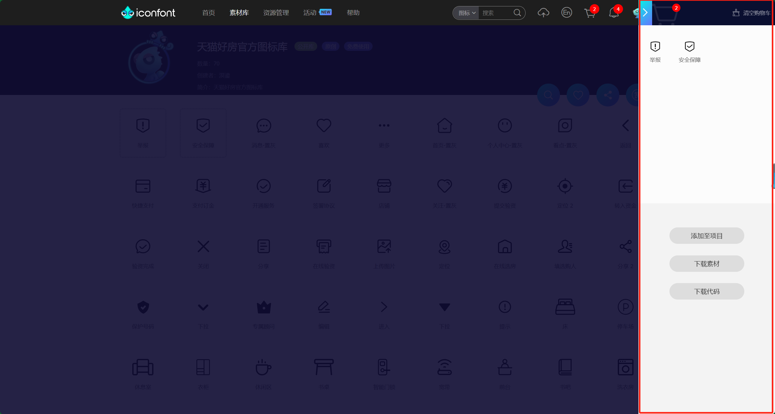
在 IconFont 官网中,选择自己需要的图标并将它们添加到购物车。图标可以根据项目需求进行分类和选择。

-
生成代码:
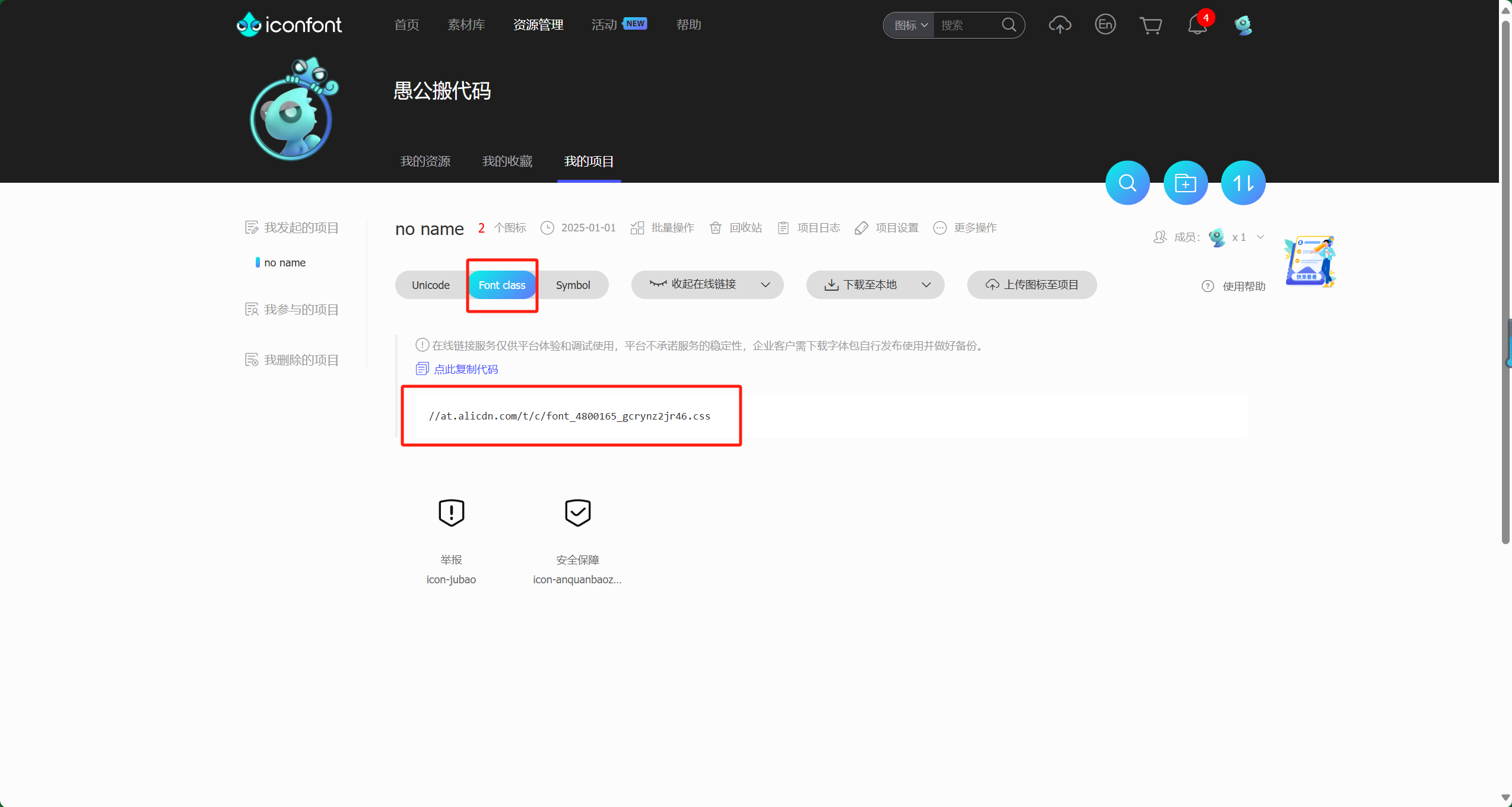
将购物车中的图标添加到自己的项目后,在对应的项目中选择 Fontclass 选项。如果您是首次使用该功能,需要先生成代码。
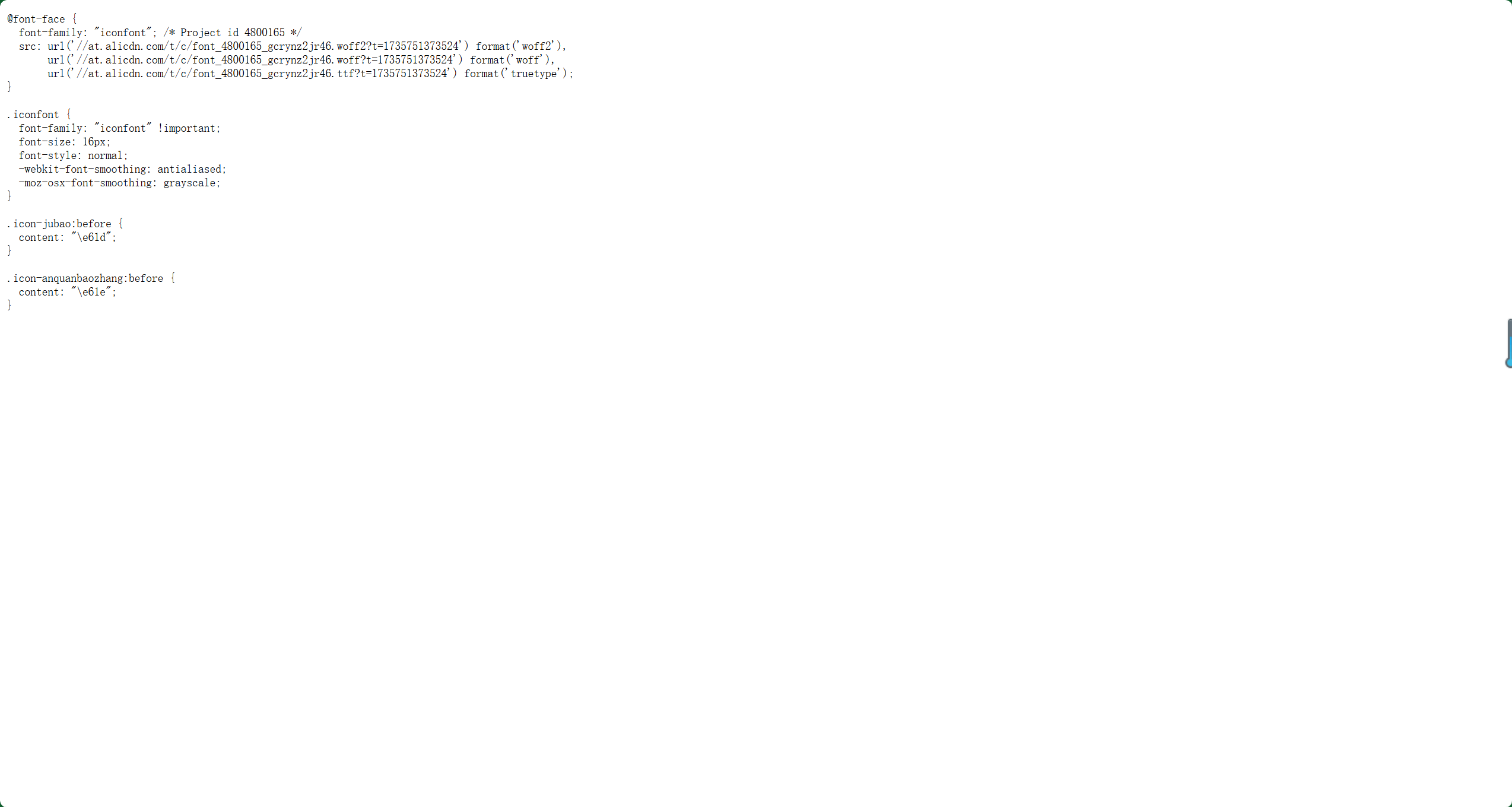
生成代码后,系统会提供一个网页版的 CSS 文件。下载并保存这个文件。
🦋1.2 配置图标到小程序项目
-
创建项目结构:
新建一个名为 MiniShop 的小程序项目,并删除其中不需要的冗余文件。 -
创建
utils文件夹:
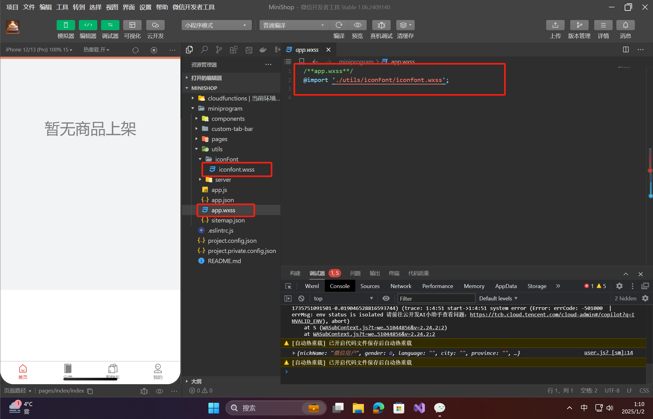
在miniprogram文件夹下新建一个名为utils的文件夹,在其中再创建一个名为iconFont的文件夹。 -
添加图标样式文件:
在iconFont文件夹下新建一个名为iconFont.wxss的文件,将之前从 IconFont 官网生成的 CSS 文件中的内容全部复制到iconFont.wxss文件中。 -
全局引用图标样式文件:
在项目的全局样式文件app.wxss中,添加对iconFont.wxss文件的引用:/* app.wxss */ @import './utils/iconFont/iconfont.wxss';
🦋1.3 使用图标
现在,您已经成功将文字图标集成到项目中,接下来可以在小程序页面中使用这些图标。以下是一个示例:
<!-- pages/index/index.wxml -->
<text class="iconfont icon-baozhuang"></text>
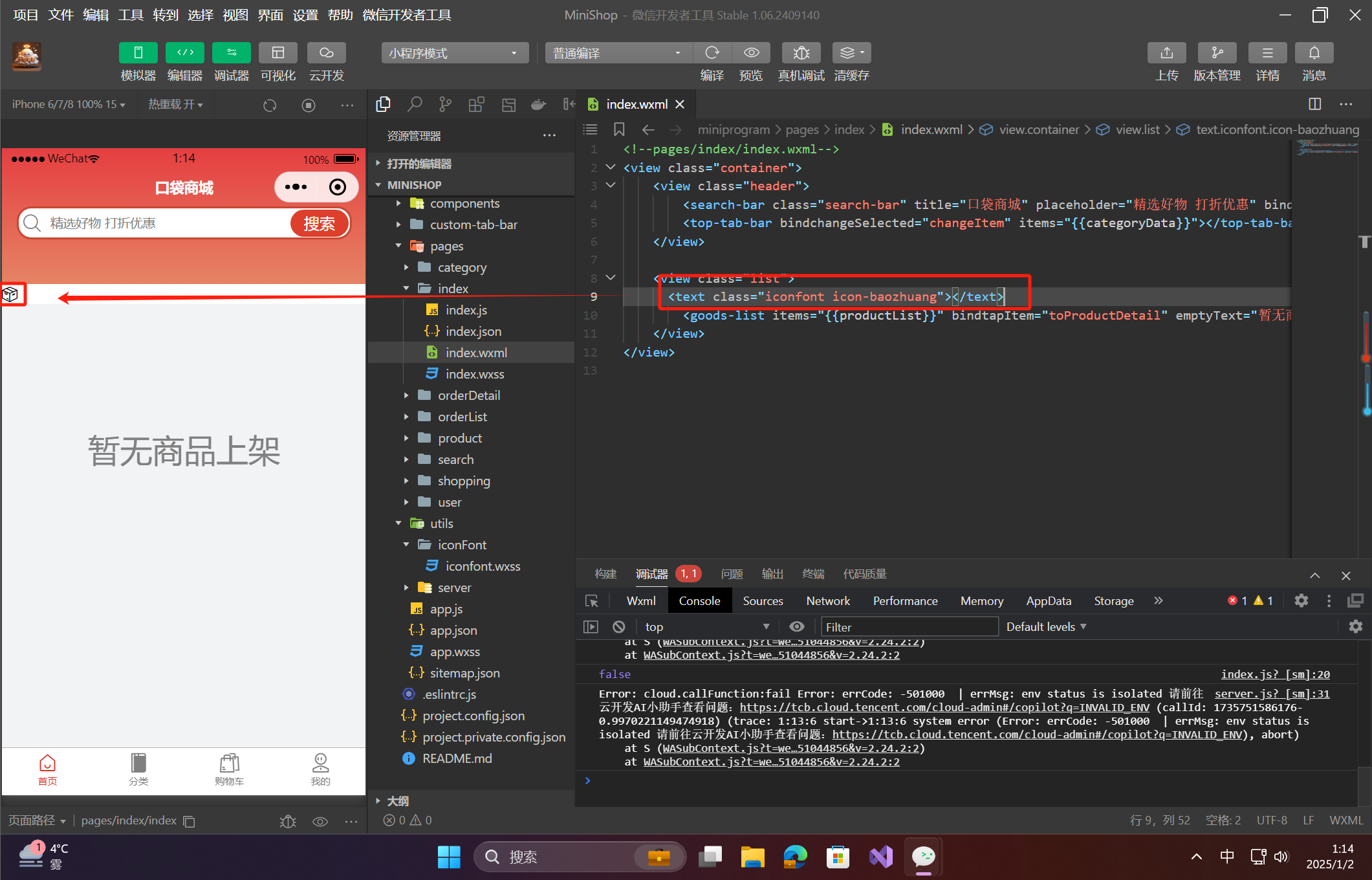
在上述代码中,icon-baozhuang 是您从 IconFont 官网中选择的图标名称,您可以在官网查看到对应的名称,也可以在 iconFont.wxss 文件中找到。
🦋1.4 测试并查看效果
完成以上步骤后,运行小程序,您应该能够看到页面上展示出了您所选择的文字图标。此时,图标已经作为文字元素展示在页面中,可以通过修改 CSS 样式进一步调整图标的大小、颜色等属性。
🔎2.应用框架的搭建
大多数电商类小程序都会采用底部多标签栏(TabBar)来作为整体页面的导航结构。以本项目为例,我们的电商应用包括 首页、分类、购物车 和 用户中心 四个模块,这四个模块会通过底部的 TabBar 来进行页面导航。为了实现更加个性化的效果,本文将介绍如何自定义 TabBar。
🦋2.1 创建页面与配置 app.json
首先,我们需要为四个模块创建页面,并在 app.json 文件中进行配置。app.json 中的 tabBar 配置项会指明底部导航栏的样式与内容。
-
新建页面:
在pages文件夹下新建四个页面,分别对应四个模块:index:首页category:分类shopping:购物车user:用户中心
-
修改
app.json配置:
在app.json文件中添加pages和tabBar配置:{ "pages": [ "pages/index/index", "pages/category/category", "pages/shopping/shopping", "pages/user/user" ], "tabBar": { "custom": true, "list": [ { "pagePath": "pages/index/index", "text": "首页" }, { "pagePath": "pages/category/category", "text": "分类" }, { "pagePath": "pages/shopping/shopping", "text": "购物车" }, { "pagePath": "pages/user/user", "text": "用户中心" } ] }, "window": { "backgroundColor": "#F6F6F6", "backgroundTextStyle": "light", "navigationBarBackgroundColor": "#F6F6F6", "navigationBarTitleText": "迷你商城", "navigationBarTextStyle": "black" }, "sitemapLocation": "sitemap.json", "style": "v2" } -
注意:
custom: true使得 TabBar 自定义。list中列出每个标签对应的页面路径和文本。
🦋2.2 创建自定义 TabBar 组件
为了自定义 TabBar,我们需要在项目中创建一个 custom-tab-bar 组件来替代默认的 TabBar。
-
创建组件:
在miniprogram文件夹下新建一个名为custom-tab-bar的文件夹,在其中新建一个名为index的组件文件夹。 -
编写
index.wxml文件:
这是 TabBar 的布局文件,我们使用view和text标签来展示每个标签,并绑定点击事件以切换页面。<!--custom-tab-bar/index.wxml--> <view class="tab"> <view class="item" bindtap="switchPage" data-index="0"> <text class="iconfont icon-shouye icon {{selectedIndex == 0 ? 'selected' : ''}}"></text> <text class="title {{selectedIndex == 0 ? 'selected' : ''}}">首页</text> </view> <view class="item" bindtap="switchPage" data-index="1"> <text class="iconfont icon-caipu icon {{selectedIndex == 1 ? 'selected' : ''}}"></text> <text class="title {{selectedIndex == 1 ? 'selected' : ''}}">分类</text> </view> <view class="item" bindtap="switchPage" data-index="2"> <text class="iconfont icon-tuangou icon {{selectedIndex == 2 ? 'selected' : ''}}"></text> <text class="title {{selectedIndex == 2 ? 'selected' : ''}}">购物车</text> </view> <view class="item" bindtap="switchPage" data-index="3"> <text class="iconfont icon-gerenzhongxin icon {{selectedIndex == 3 ? 'selected' : ''}}"></text> <text class="title {{selectedIndex == 3 ? 'selected' : ''}}">我的</text> </view> </view> -
编写
index.wxss文件:
在index.wxss文件中为 TabBar 添加样式,设置图标的大小、颜色及选中状态样式。/* custom-tab-bar/index.wxss */ @import '../utils/iconFont/iconfont.wxss'; .tab { height: 49px; width: 100%; background-color: white; border-top: solid 1px #b5afb2; display: flex; flex-direction: row; justify-content: space-around; } .item { height: 100%; width: 25%; text-align: center; padding-top: 5px; display: flex; flex-direction: column; } .icon { font-size: 20px; color: gray; } .title { margin-top: 2px; font-size: 10px; color: gray; } .selected { color: #d63329; } -
编写
index.js文件:
在index.js中处理 TabBar 标签的点击切换。// custom-tab-bar/index.js Component({ data: { selectedIndex: 0, // 当前选中的标签 pageList: [ '/pages/index/index', '/pages/category/category', '/pages/shopping/shopping', '/pages/user/user' ] }, methods: { switchPage: function (event) { let index = Number(event.currentTarget.dataset.index); wx.switchTab({ url: this.data.pageList[index], }); } } });
🦋2.3 处理页面生命周期
为了确保 TabBar 在切换页面时能够正确地显示选中状态,我们需要在每个页面的生命周期方法中更新选中的标签。
-
修改
index.js:
在index.js文件的onShow方法中设置选中的标签:// pages/index/index.js Page({ onShow: function () { this.getTabBar().setData({ selectedIndex: 0 }); } }); -
修改其他页面的
onShow方法:
对于其他页面(如category.js、shopping.js、user.js),也需要在onShow方法中设置选中的标签:// pages/category/category.js Page({ onShow: function () { this.getTabBar().setData({ selectedIndex: 1 }); } }); // pages/shopping/shopping.js Page({ onShow: function () { this.getTabBar().setData({ selectedIndex: 2 }); } }); // pages/user/user.js Page({ onShow: function () { this.getTabBar().setData({ selectedIndex: 3 }); } });
🦋2.4 测试效果
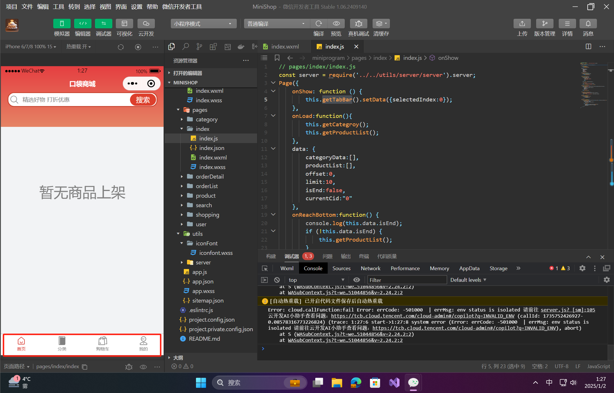
完成上述步骤后,运行小程序,您应该能够看到 TabBar 已经自定义并且能够正确切换页面。每次切换页面时,TabBar 上的选中状态也会随着页面的切换而更新。
🔎3.首页头部模块的开发
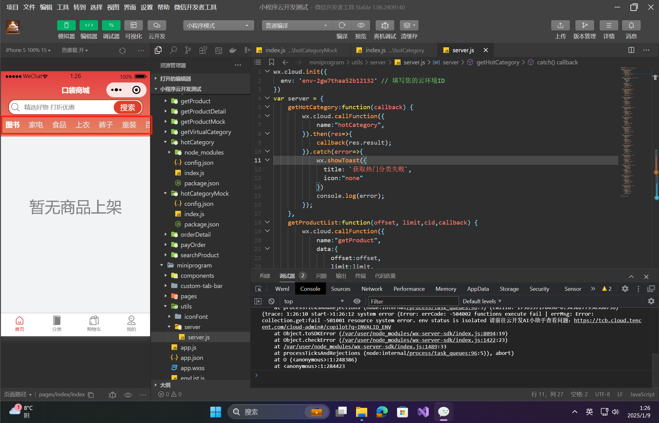
首页头部模块主要由 搜索栏 和 热门分类栏 组成。每个分类栏展示不同的推荐商品列表。为了增强扩展性和复用性,我们将这两个模块封装成自定义组件:search-bar 和 top-tab-bar。下面将依次介绍如何实现这些组件及其集成。
🦋3.1 创建 search-bar 组件
☀️3.1.1 search-bar/index.wxml
这是 search-bar 组件的布局文件,包含标题、搜索框和搜索按钮。
<!--components/search-bar/index.wxml-->
<view class="header">
    <view class="title"><text>{{title}}</text></view>
    <view class="searchBar">
        <text class="iconfont icon-sousuo icon"></text>
        <input class="input" placeholder="{{placeholder}}" bindinput="input" value="{{value}}"></input>
        <view class="searchBtn" bindtap="btnTap">搜索</view>
    </view>
</view>
☀️3.1.2 search-bar/index.wxss
为组件添加样式,调整布局和字体。
/* components/search-bar/index.wxss */
@import '../../utils/iconFont/iconfont.wxss';
.title {
    width: 100%;
    text-align: center;
    margin-top: 30px;
    color: white;
    font-size: 15px;
    font-weight: bold;
}

.searchBar {
    margin-top: 10px;
    border: solid 2px #c94732;
    height: 30px;
    border-radius: 15px;
    margin-left: 15px;
    margin-right: 15px;
    background-color: white;
    display: flex;
    flex-direction: row;
}

.icon {
    font-size: 18px;
    line-height: 30px;
    color: gray;
    margin-left: 5px;
}

.input {
    width: 60%;
    height: 30px;
    margin-left: 10px;
    font-size: 13px;
}

.searchBtn {
    position: absolute;
    right: 18px;
    line-height: 28px;
    margin-top: 1px;
    width: 60px;
    background-color: #dd3f2c;
    color: white;
    text-align: center;
    border-radius: 15px;
}
☀️3.1.3 search-bar/index.js
在组件中处理搜索按钮点击事件和输入框内容变化。
// components/search-bar/index.js
Component({
    /**
     * 组件的属性列表
     */
    properties: {
        title:{
            type:String,
            value:"标题"
        },
        placeholder:{
            type:String,
            value:"请输入..."
        }
    },

    /**
     * 组件的初始数据
     */
    data: {
        value:""
    },

    /**
     * 组件的方法列表
     */
    methods: {
        btnTap:function() { // 点击搜索按钮后执行的方法
            this.triggerEvent('searchBtnTap', this.data.value);
        },
        input:function(event) { // 输入框变化时同步更新数据
            this.setData({
                value:event.detail.value
            });
        },
        clear:function() { // 清空输入框内容
            this.setData({
                value:""
            });
        }
    }
})
🦋3.2 创建 top-tab-bar 组件
☀️3.2.1 top-tab-bar/index.wxml
此组件使用 scroll-view 实现横向滑动的分类标签。
<!--components/top-tab-bar/index.wxml-->
<view>
    <scroll-view scroll-x="{{true}}" class="scroll" scroll-into-view="{{anchorID}}" scroll-with-animation="{{true}}">
        <view wx:for="{{items}}"
        wx:key="index"
        id="{{'id' + index}}"
        class="item {{currentSelected == index? 'selected': ''}}"
        bindtap="tapItem"
        data-index="{{index}}">{{item.title}}</view>
    </scroll-view>
</view>
☀️3.2.2 top-tab-bar/index.wxss
为分类标签添加样式,确保它们横向排列且支持滑动。
/* components/top-tab-bar/index.wxss */
.scroll {
    height: 40px;
    width: 100%;
    white-space: nowrap;
    padding-left: 10px;

}

.item {
    display: inline-block;
    height: 40px;
    line-height: 40px;
    text-align: center;
    margin-right: 20px;
    color:#e1e1e1;
    font-size: 15px;
}

.selected {
    font-weight: bold;
    color:white;
}
☀️3.2.3 top-tab-bar/index.js
在 top-tab-bar 组件中处理选中的栏目,并触发事件通知父组件。
// components/top-tab-bar/index.js
Component({
    /**
     * 组件的属性列表
     */
    properties: {
        items:{ // 栏目数据
            type:Array,
            value:[{title:"栏目1"},{title:"栏目2"},{title:"栏目3"},{title:"栏目4"},{title:"栏目5"},{title:"栏目6"},{title:"栏目7"},{title:"栏目8"},{title:"栏目9"},{title:"栏目10"},{title:"栏目11"},{title:"栏目12"}]
        },
        selected:{ // 记录当前选中的栏目
            type:Number,
            value:0
        }
    },

    lifetimes:{
        ready:function() {
            this.setData({
                currentSelected:this.data.selected,
                anchorID:'id' + this.data.selected
            });
        }
    },
    /**
     * 组件的初始数据
     */
    data: {
        currentSelected:0,
        anchorID:'id0'
    },

    /**
     * 组件的方法列表
     */
    methods: {
        tapItem:function(event) { // 点击栏目后的回调
            let index = Number(event.currentTarget.dataset.index);
            this.setData({
                currentSelected:index,
                anchorID:'id'+index
            });
            this.triggerEvent("changeSelected", {index:index, item:this.data.items[index]});
        }
    }
})
🦋3.3 集成组件到首页
☀️3.3.1 修改 index/index.json
在 index.json 文件中引入 search-bar 和 top-tab-bar 组件。
{
  "usingComponents": {
    "search-bar": "../../components/search-bar/index",
    "top-tab-bar": "../../components/top-tab-bar/index"
  },
  "navigationStyle": "custom"
}
☀️3.3.2 修改 index/index.wxml
将 search-bar 和 top-tab-bar 组件嵌入首页,并绑定事件。
<!-- pages/index/index.wxml -->
<view class="container">
  <view class="header">
    <search-bar
      class="search-bar"
      title="口袋商城"
      placeholder="精选好物 打折优惠"
      bindsearchBtnTap="toSearch"
    ></search-bar>
    <top-tab-bar
      bindchangeselected="changeItem"
      items="{{categoryData}}"
    ></top-tab-bar>
  </view>
  <view>商品列表待开发</view>
</view>
☀️3.3.3 修改 index/index.wxss
为首页布局添加样式。
.header {
    width: 100%;
    height: 140px;
    background-image: linear-gradient(to bottom, #e53f41, #e68465);
    overflow: hidden;
    position: fixed;
    z-index: 100;
}
☀️3.3.4 修改 index/index.js
在 index.js 中调用云函数获取热门分类,并更新页面数据。
// pages/index/index.js
const server = require('../../utils/server/server').server;

Page({
  data: {
    categoryData: [],
  },
  onLoad() {
    this.getCategory();
  },
  onShow() {
    this.getTabBar().setData({ selectedIndex: 0 });
  },
  toSearch(event) {
    let key = event.detail;
    if (key.length === 0) {
      wx.showToast({ title: '请输入搜索内容', icon: 'none' });
      return;
    }
    console.log(`搜索-${key}`);
    this.selectComponent('.search-bar').clear();
  },
  changeItem(event) {
    console.log(`切换分类-${event.detail.item.title}`);
  },
  getCategory() {
    server.getHotCategory(res => {
      this.setData({ categoryData: res });
    });
  },
});
🦋3.4 数据集准备
☀️3.4.1 创建数据集合 shop_category
在云开发控制台的云数据库模块中新建一个名为 shop_category 的数据集合。数据集合的字段包括:
| 字段名 | 类型 | 描述 |
|---|---|---|
cid |
String | 分类 ID |
title |
String | 分类名称 |
☀️3.4.2 手动或使用云函数插入数据
手动方式:你可以在云开发控制台中直接添加数据。
或者,可以通过云函数来生成模拟数据。以下是一个插入数据的云函数示例:
const cloud = require('wx-server-sdk')
cloud.init()
const db = cloud.database();
exports.main = async (event, context) => {
    let collection = db.collection("shop_category");
    await collection.add({
        data:{
            cid:'0',
            title:'图书',
        }
    });
    await collection.add({
        data:{
            cid:'1',
            title:'家电',
        }
    });
    await collection.add({
        data:{
            cid:'2',
            title:'食品',
        }
    });
    await collection.add({
        data:{
            cid:'3',
            title:'上衣',
        }
    });
    await collection.add({
        data:{
            cid:'4',
            title:'裤子',
        }
    });
    await collection.add({
        data:{
            cid:'5',
            title:'童装',
        }
    });
    await collection.add({
        data:{
            cid:'6',
            title:'百货',
        }
    });
    await collection.add({
        data:{
            cid:'7',
            title:'电子',
        }
    });
    await collection.add({
        data:{
            cid:'8',
            title:'玩具',
        }
    });
    await collection.add({
        data:{
            cid:'9',
            title:'美妆',
        }
    });
    return;
}
☀️3.4.3 获取热门分类的云函数 getHotCategory
创建一个新的云函数来获取 shop_category 数据集合中的所有分类信息。
const cloud = require('wx-server-sdk')
cloud.init()
const db = cloud.database();
exports.main = async (event, context) => {
    let collection = db.collection("shop_category");
    let data = await collection.get();
    if (data.data.length==0) {
        let res = await cloud.callFunction({
            name:"hotCategoryMock"
        });
        if (res != null) {
            console.log(res);
        }
        data = await collection.get();
    }
    return data.data;
}
☀️3.4.4 封装服务器端交互方法
为了方便调用,你可以在 utils 文件夹下新建一个名为 server.js 的文件,并在其中封装与云函数的交互方法。以下是 server.js 的代码示例:
wx.cloud.init();

var server = {
    getHotCategory:function(callback) {
        wx.cloud.callFunction({
            name:"hotCategory",
        }).then(res=>{
            callback(res.result);
        }).catch(error=>{
            wx.showToast({
              title: `获取热门分类失败`,
              icon:"none"
            })
            console.log(error);
        });
    },
};

exports.server = server;
☀️3.4.5 使用封装的 getHotCategory 方法
在你的页面或其他地方调用封装的方法获取热门分类:
const server = require('utils/server.js');

server.getHotCategory(function(data) {
  console.log("热门分类数据:", data);
});
🔎4.商品列表的开发
🦋4.1 创建商品列表组件
在 components 文件夹下创建一个 goods-list 文件夹,并在其中创建以下文件:
- index.wxml:商品列表组件的结构
- index.wxss:商品列表组件的样式
- index.js:商品列表组件的逻辑代码
☀️4.1.1 index.wxml
<!--components/goods-list/index.wxml-->
<view class="container">
    <view class="row">
        <view wx:for="{{items}}" wx:key="index" class="item" bindtap="touchItem" data-index="{{index}}">
            <view class="content">
                <view class="cover">
                    <image class="img" src="{{item.img}}"></image>
                    <text class="tag">{{item.cname}}</text>
                </view>
                <view class="text">
                    <text class="name">{{item.name}}</text>
                    <text class="discount">{{item.discount}}折</text>
                </view>
                <view>
                    <text class="price">¥{{item.price}}</text>
                    <text class="saleCount">已售{{item.saleCount}}件</text>
                </view>
            </view>
        </view>
        <view class="empty" wx:if="{{items.length == 0}}">{{emptyText}}</view>
    </view>
</view>
☀️4.1.2 index.wxss
/* components/goods-list/index.wxss */
.container {
    background-color: #f2f3f5;
}

.row {
    display: flex;
    flex-direction: row;
    flex-wrap: wrap;
}

.item {
    width: 50%;
    height: 200px;
}

.content {
    margin: 5px;
    width: calc(100%-10px);
    height: 190px;
    background-color: white;
    border-radius: 8px;
    overflow: hidden;
}

.img {
    width: 100%;
    height: 140px;
    background-color:#d1d1d1;
}

.text {
    position: relative;
}

.name {
    margin-left: 5px;
    font-size: 15px;
    font-weight: bold;
}

.discount {
    font-size: 10px;
    font-weight: bold;
    margin-left: 5px;
    background-color: #dd7980;
    line-height: 10px;
    border-radius: 4px;
    padding: 2px 6px;
    color: white;
    position:absolute;
    top: 4px;
}

.saleCount {
    margin-left: 5px;
    font-size: 12px;
    color: gray;
}
.cover {
    position: relative;
}

.tag {
    left: 0px;
    font-size: 10px;
    padding: 2px 6px;
    background-image: linear-gradient(to bottom, #e53f41, #e65162ce);
    border-radius: 0px 0px 4px 0px;
    position:absolute;
    color: white;
}

.price {
    color: #ca524f;
    margin-left: 2px;
    font-size: 14px;
}

.empty {
    width: 100%;
    height: 500px;
    line-height: 300px;
    text-align: center;
    font-size: 33px;
    color: gray;
}
☀️4.1.3 index.js
// components/goods-list/index.js
Component({
    /**
     * 组件的属性列表
     */
    properties: {
        items:{
            type:Array,
            value:[{
                name:"商品名称",
                img:"",
                gid:"",
                cid:"0",
                cname:"分类",
                price:"0.0",
                discount:"1",
                saleCount:100
            },{
                name:"商品名称",
                img:"",
                gid:"",
                cid:"0",
                cname:"分类",
                price:"0.0",
                discount:"1",
                saleCount:100
            }]
        },
        emptyText:{
            type:String,
            value:"暂无数据"
        }
    },

    /**
     * 组件的初始数据
     */
    data: {

    },

    /**
     * 组件的方法列表
     */
    methods: {
        touchItem:function(event) {
            let index = Number(event.currentTarget.dataset.index);
            let item = this.data.items[index];
            this.triggerEvent("tapItem", {index:index, item:item});
        }
    }
})
🦋4.2 商品数据模拟(云函数)
使用云函数模拟从数据库获取商品数据。可以在云函数中插入以下模拟商品数据:
const cloud = require('wx-server-sdk')
cloud.init({

})
const db = cloud.database();
exports.main = async (event, context) => {
    // 拿到参数
    let limit = event.limit;
    let offset = event.offset;
    let cid = event.cid;
    let collection = db.collection("shop_product");
    let data = await collection.where({
        cid:cid
    }).skip(offset).limit(limit).get();
    if (data.data.length==0 && offset == 0 && cid == "0") {
        let res = await cloud.callFunction({
            name:"getProductMock"
        });
        if (res != null) {
            console.log(res);
        }
        data = await await collection.where({
            cid:cid
        }).skip(offset).limit(limit).get();
    }
    return data.data;
}
const cloud = require('wx-server-sdk')
cloud.init({

})
const db = cloud.database();
exports.main = async (event, context) => {
    let collection = db.collection("shop_product");
    await collection.add({
        data:{name:"JS编程",img:"",gid:"01", cid:"0", cname:"图书",price:"56.0",discount:"8.8",saleCount:34}
    });
    await collection.add({
        data:{name:"Python编程",img:"",gid:"02", cid:"0", cname:"图书",price:"86.0",discount:"9.0",saleCount:1234}
    });
    await collection.add({
        data:{name:"iOS编程",img:"",gid:"03", cid:"0", cname:"图书",price:"59.0",discount:"9.0",saleCount:66}
    });
    await collection.add({
        data:{name:"ReactNative",img:"",gid:"04", cid:"0", cname:"图书",price:"35.0",discount:"6.0",saleCount:16}
    });
    await collection.add({
        data:{name:"小程序开发",img:"",gid:"05", cid:"0", cname:"图书",price:"35.0",discount:"5.5",saleCount:626}
    });
    await collection.add({
        data:{name:"Vue编程",img:"",gid:"06", cid:"0", cname:"图书",price:"67.0",discount:"7.0",saleCount:124}
    });

    return;
}
🦋4.3 商品列表组件的使用
在 index/index.wxml 中引用该组件并传递数据:
<!-- index/index.wxml -->
<view class="list">
    <goods-list items="{{productList}}" bindtapItem="toProductDetail" emptyText="暂无商品上架"></goods-list>
</view>
🦋4.4 页面的逻辑代码
☀️4.4.1 获取商品数据
在页面的 index/index.js 中,增加商品列表的获取逻辑,并处理分页。
// pages/index/index.js
const server = require('../../utils/server/server').server;
Page({
    onShow: function () {
        this.getTabBar().setData({selectedIndex:0});
    },
    onLoad:function(){
        this.getCategroy();
        this.getProductList();
    },
    data: {
        categoryData:[],
        productList:[],
        offset:0,
        limit:10,
        isEnd:false,
        currentCid:"0"
    },
    onReachBottom:function() {
        console.log(this.data.isEnd);
        if (!this.data.isEnd) {
            this.getProductList();
        }
    },
    toSearch:function(event) {
        let key = event.detail;
        if (key.length == 0) {
            wx.showToast({
              title: '请输入搜索内容',
              icon:'none'
            });
            return;
        }
        console.log(`搜索-${event.detail}`);

        wx.navigateTo({
          url: `/pages/search/search?key=${key}`,
        })
        this.selectComponent('.search-bar').clear();
    },
    changeItem:function(event) {
        console.log(`切换分类-${event.detail.item.title}-${event.detail.item.cid}`);
        this.setData({
            currentCid:event.detail.item.cid,
            offset:0,
            productList:[],
            isEnd:false
        });
        this.getProductList();

    },
    toProductDetail:function(event) {
        console.log(`查看商品详情-${event.detail.item.name}`);
        wx.navigateTo({
          url: '../product/product?gid=' + event.detail.item.gid,
        })
    },
    getCategroy:function() {
        server.getHotCategory(res=>{
            this.setData({
                categoryData:res
            });
        });
    },
    getProductList:function() {
        server.getProductList(this.data.offset,this.data.limit, this.data.currentCid,res=>{
            let isEnd = false;
            console.log(res.length);
            if (res.length < this.data.limit) {
                isEnd = true;
            }
            this.setData({
                productList:this.data.productList.concat(res),
                offset:this.data.offset + res.length,
                isEnd:isEnd
            });
        });
    }
})
🦋4.5 样式调整
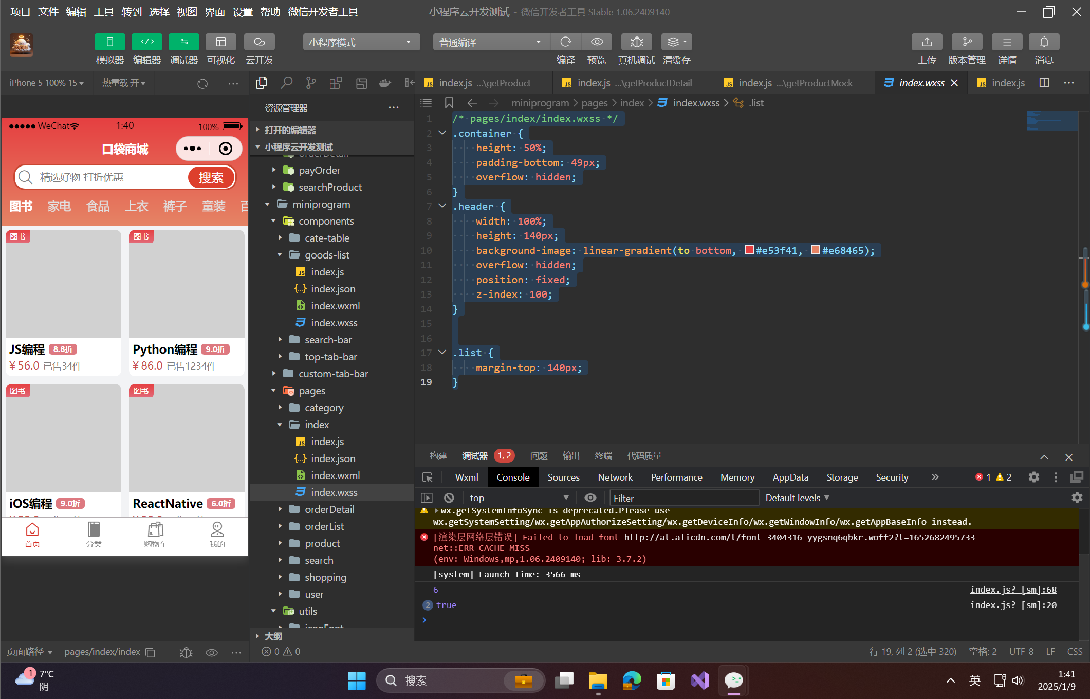
为了确保页面头部吸顶效果与商品列表的布局不冲突,需要在 index/index.wxss 中做以下样式调整:
/* pages/index/index.wxss */
.container {
    height: 50%;
    padding-bottom: 49px;
    overflow: hidden;
}
.header {
    width: 100%;
    height: 140px;
    background-image: linear-gradient(to bottom, #e53f41, #e68465);
    overflow: hidden;
    position: fixed;
    z-index: 100;
}


.list {
    margin-top: 140px;
}

- 点赞
- 收藏
- 关注作者
评论(0)